DTG Printing Guide
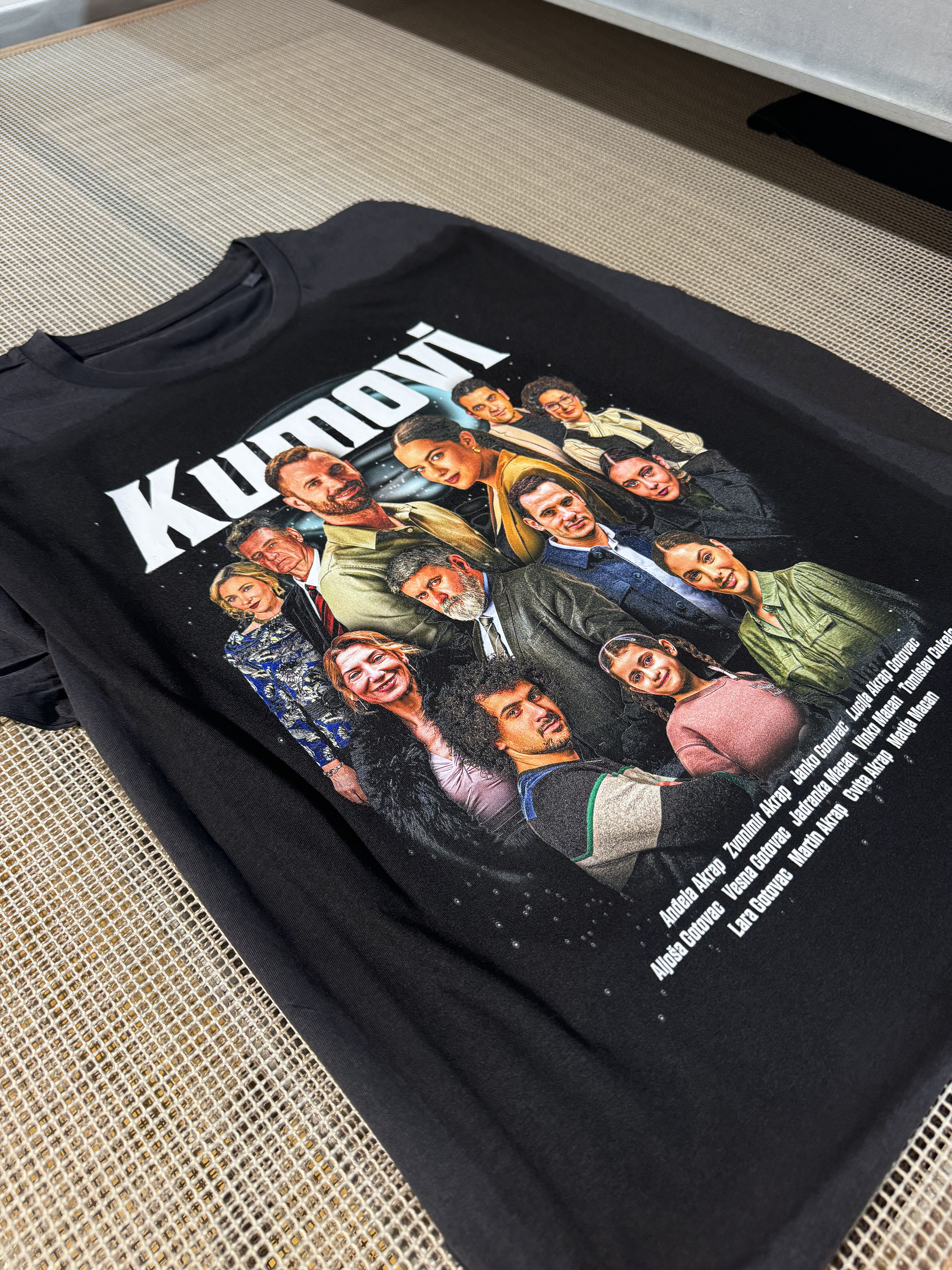
DTG Printing Made Simple
DTG (Direct-to-Garment) is an amazing way to decorate textiles — you can print complex designs with gradients, photos, and unlimited colors directly onto garments.
But unlike a screen, a cotton tee is a living material: every fiber, weave, and tone plays a role in how your design comes out.
How DTG Works in Practice
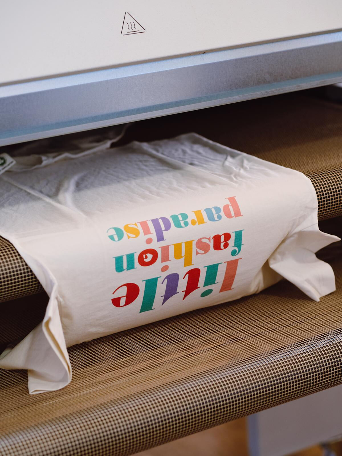
- The garment is fixed flat on a platen.
- Water-based inks are sprayed directly into the fibers.
- On dark items, a white “underbase” is printed first so colors pop.
The magic: prints are soft to the touch, breathable, and eco-friendly.
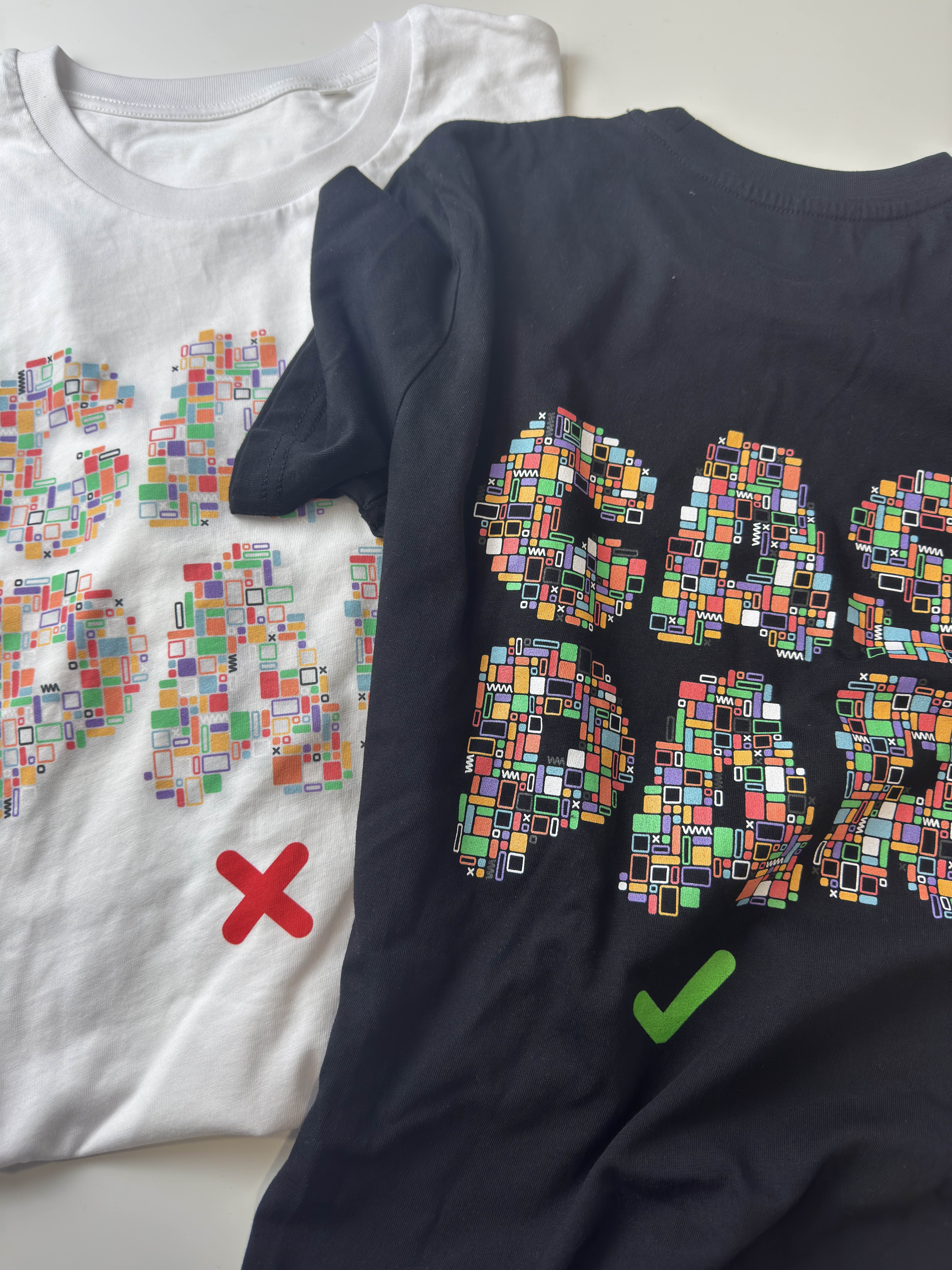
The reality: the same design may look slightly different on a white organic tee vs. a black hoodie, because fibers, tone, and thickness all affect the print.
Why Results Vary Across Fabrics
Even when you follow all the rules, fabric is the biggest variable in DTG:
- Color shifts: Bright tones will look different on heathers, naturals, or deep-dyed garments.
- Texture influence: Smooth cotton jersey shows crisper detail than a heavier fleece.
- Underbase effect: Shadows/glows look softer on white garments, but sharper on darks because of the white layer beneath.
- Fiber specks: Organic cotton may show tiny fibers through lighter inks — a natural sign of authenticity.
At Caspar, we use only Stanley/Stella garments (GOTS-certified, Fair Wear) because they offer the best consistency and sustainability on the market.
File Preparation — The Do’s
- Design in RGB (Adobe RGB 1998) for a wide color range.
- Export as PNG with transparency.
- Prepare files at 150 dpi+ at final print size.
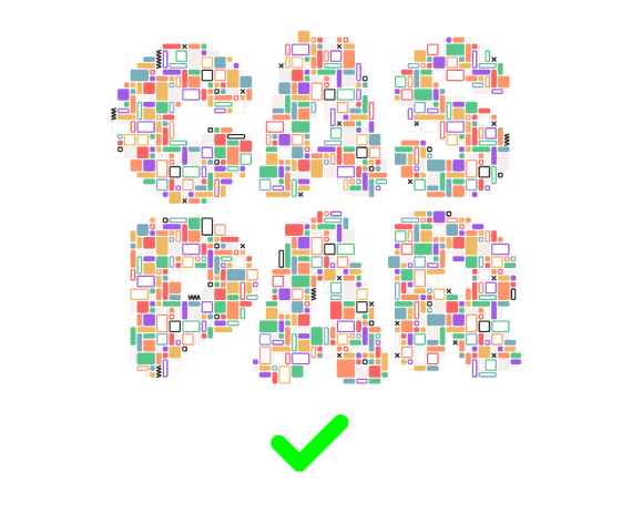
- Test your art against both light and dark mockups.
- Use solid shapes for shadows/gradients instead of semi-transparent fades.
File Preparation — The Don’ts
- Don’t upload low-res files → they’ll blur when scaled.
- Don’t design in CMYK → expect unwanted shifts.
- Don’t rely on super-subtle tones → they may vanish in real prints.
- Don’t expect identical results across every garment → natural variation is part of DTG.
Summary: What Works (and What Doesn’t)
Works Well
- Bold graphics, illustrations, and logos
- Photography with good contrast
- Typography in clear, solid fonts
- Bright colors on lighter bases
Challenging in DTG
- Semi-transparent fades on darks (prints as “harder edges”)
- Very fine lines under 1 pt (may not hold)
- Large dark solids on light garments (can look less saturated)
Ready to launch your design?
Start with a quick sample to validate colors and hand-feel — then publish it to your store with confidence.